Book design is one of my favorite things to gush about. (And I do mean gush.) I could sift through books with textured paper and gilded edges all day, appreciating the elements of design and production choices that went into each decision.
Printing a book with “fancy” elements is expensive and is mainly done with offset printing, which is much more affordable in huge quantities (upwards of 10K copies, generally). Thus, many independently published books don’t get the special treatment most editors and authors would like them to get.
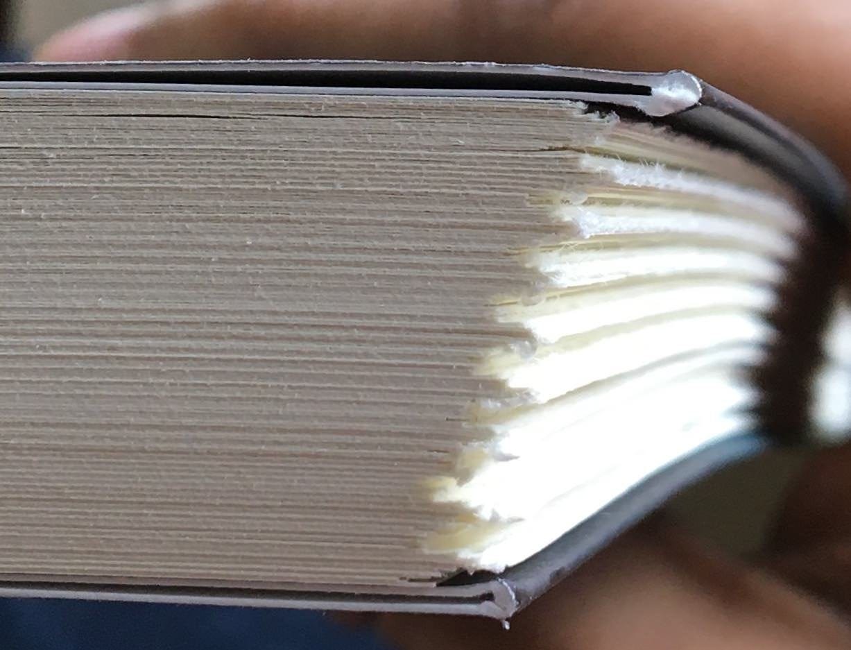
I remember working on a historical murder mystery—a very Jack the Ripper-style story with its own fascinating twists—and I desperately wanted to print the book with ragged edges. We just couldn’t afford the justification for a print run so large as such a small indie press, and thus, I had to settle for creme interior paper rather than white to give this literary gem a “historical fiction” feel. (Not sure what ragged edging is? Read on.)
That book not getting its deserved ragged edges still haunts me. I know that sounds dramatic, but I genuinely think about every book I’ve ever worked on from time to time, and it always comes back to design for me. It is the magic that makes a book into a book.
Understanding Book Cover Design Elements
From the choice of fonts to the intricate printing techniques, each design component plays a vital role in captivating readers and conveying the essence of the written word.
Cover materials and finishes: Crafting a tactile masterpiece
Readers most see the artistry of book design in selecting the perfect cover materials and finishes.
Embossing and Debossing
In book cover design, the visual allure is not limited to colors and imagery alone. The intricate interplay of texture and dimension sets a cover apart, captivating readers before they even open the book.
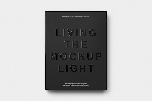
Embossing and debossing are techniques that manipulate the surface of the cover, adding depth and texture to specific elements. Embossing raises selected design elements, creating a visually striking effect that begs to be touched. It elevates the ordinary to the extraordinary, making titles, images, or patterns pop off the cover. Conversely, debossing involves pressing design elements into the cover, creating recessed areas that invite exploration with a gentle touch.
Choosing appropriate designs and images
The key to successful embossing and debossing lies in selecting designs and images that harmonize with the book's content, genre, and intended audience. Intricate and elaborate designs may work well for fantasy or historical novels, evoking a sense of craftsmanship and attention to detail. Simpler, minimalist designs, on the other hand, can enhance the elegance and refinement of literary fiction or non-fiction titles. It is essential to balance visual impact and the subtlety required to maintain the cover's overall aesthetic.

Considerations for typography
Typography is pivotal in book cover design, and embossing and debossing can amplify its impact. When incorporating embossed or debossed typography, it is crucial to ensure legibility and readability. Careful consideration of font choices, letter spacing, and size is essential to maintain clarity while adding the desired texture and dimension. The interplay between embossed or debossed typography and other design elements should create a cohesive and visually pleasing composition.
Foil Stamping
With a touch of metallic allure, foil stamping elevates book covers to new heights of elegance.
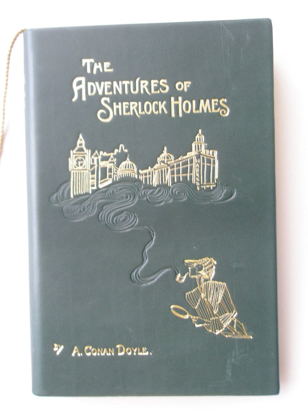
Foil stamping involves the application of a thin metallic or colored foil onto the book cover using heat and pressure. The foil adheres to specific areas, creating a radiant, eye-catching effect that draws the reader's gaze. Whether a striking gold, a regal silver, or a vibrant hue, foil stamping transforms ordinary titles and key design elements into luminous beacons that demand attention.
Titles and key elements—like an image or a pattern—play a pivotal role in conveying the essence of a book. Foil stamping allows these crucial components to shine with an air of sophistication and gravitas.
Selecting suitable foil colors
The choice of foil color is a crucial decision in the foil stamping process. It is an opportunity to align the aesthetic of the book cover with its content, genre, and target audience. The timeless elegance of gold or silver foil may be ideal for classical literature or historical novels, evoking a sense of grandeur and tradition. Vibrant foil colors like blue, red, or green may be suitable for contemporary fiction or genres that embrace boldness and visual impact. The selection of the appropriate foil color requires careful consideration to ensure that it complements the overall design and enhances the desired mood.
I once had a middle-grade fantasy author-illustrator writing a trilogy about siblings stumbling upon a magic land and needing to help save it. He illustrated these decadent covers, reminiscent of classic literature and high fantasy. I would’ve loved to emboss and foil stamp the titles of his books in a rainbow hue.
Balancing simplicity and complexity
A touch of foil can elevate a cover, but an excessive application can overwhelm and diminish its effect. Achieving the right balance involves a keen understanding of design principles, including the placement of foiled elements, the interplay with other design elements, and maintaining overall coherence and visual harmony.
Spot UV Coating
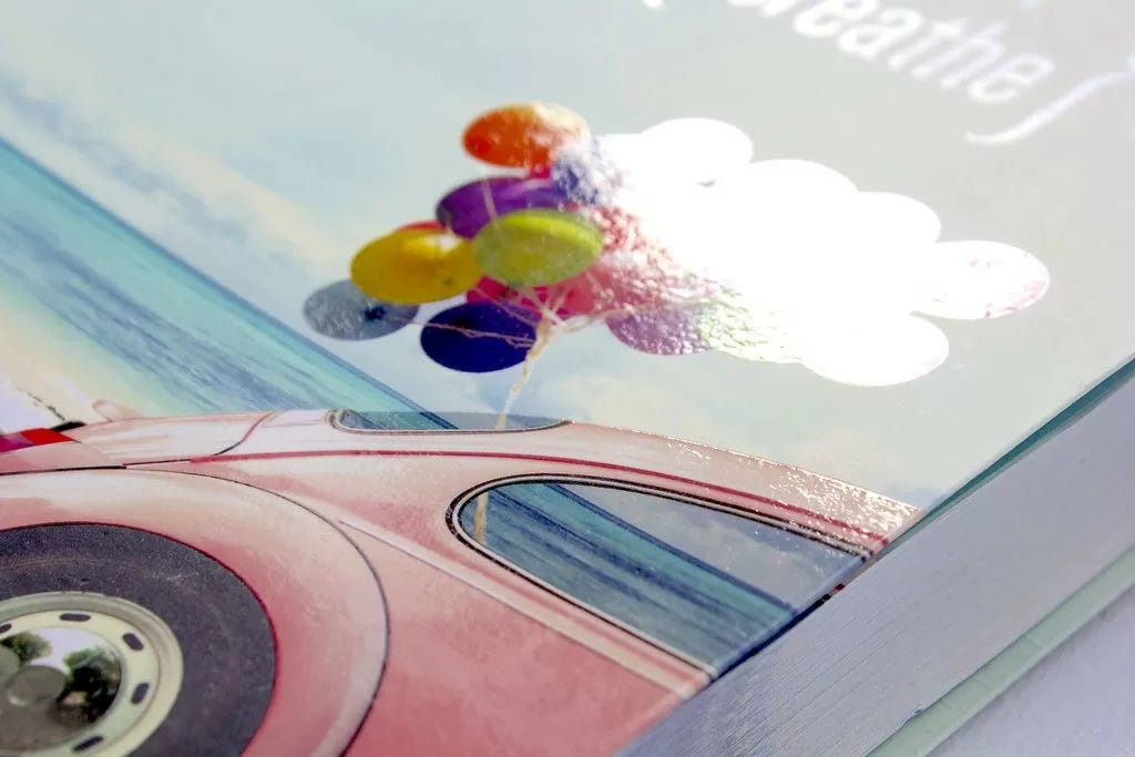
Spot UV coating is a printing technique that involves applying a glossy or matte coating to specific areas of the book cover, creating a striking contrast between the coated and uncoated surfaces. This selective shine accentuates certain elements, adding depth and visual allure. Spot UV coating can highlight titles, artwork, patterns, or any design element that deserves a touch of brilliance, subtly drawing the reader's attention without overwhelming the overall design.
Balancing aesthetics and functionality
While spot UV coating offers immense creative potential, it is essential to navigate a few considerations. Achieving consistency and accuracy in applying the coating requires expertise and precision. Designers must carefully plan the application, ensuring it aligns with the overall design concept and enhances the book's visual storytelling. Moreover, they must balance aesthetics and functionality, considering factors like readability, durability, and the desired tactile experience for the reader.
Matte and Glossy Finishes
Matte and glossy finishes represent two distinct aesthetic realms. Matte finishes exude a refined elegance, characterized by a non-reflective, velvety surface that evokes sophistication and subtlety. These finishes create a smooth and even appearance, lending a touch of understated grace to book covers. On the other hand, glossy finishes embrace a vibrant, reflective surface that exudes energy and visual pop.
The choice between matte and glossy finishes should align with the genre, tone, and intended atmosphere of the book. Matte finishes are well-suited for genres that demand a more introspective and intellectual approach, such as literary fiction or thought-provoking non-fiction. They create an aura of seriousness and sophistication, drawing readers into contemplative realms. In contrast, glossy finishes excel in genres that embrace vivid storytelling, bold narratives, or genres that seek to captivate with a sense of immediacy, such as crime thrillers, romance, or adventure novels.
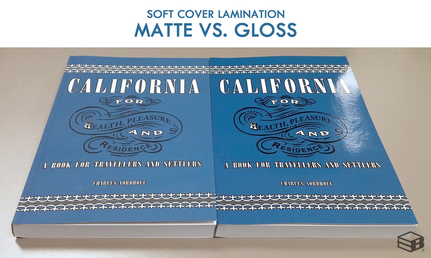
I’m a sucker for a well-done matte finish, but, in my experience, matte print-on-demand (POD) books tend to scuff more easily than glossy ones, and since I couldn’t bear to sell an imperfect book, the matte titles contributed much more to our “used” pile than the glossy.
Regardless of the chosen finish, maintaining consistency in design elements is paramount. The finish should complement and enhance the overall design concept, working harmoniously with other visual elements such as typography, illustrations, or patterns. Whether opting for matte or glossy finishes, designers must ensure that the choice remains consistent throughout the cover and aligns with the intended visual narrative.
Printing techniques: Unleashing the magic of craftsmanship
The sorcery of printing techniques fascinates me. I used to love meetings with our printer rep to chat about all the potential options for our books. (And that’s saying a lot because who ever loves meetings?)
Gilded Edges
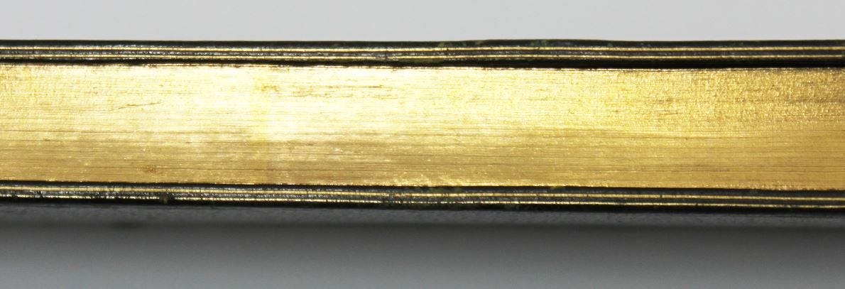
Gilding is an age-old technique that involves applying a thin layer of precious metal, such as gold or silver, to the edges of a book's pages. This process imbues the book with an aura of opulence and luxury, reminiscent of an era when books were revered as sacred objects. Gilded edges elevate a book beyond its mere literary contents, transforming it into a cherished artifact that captures the eye and stirs the imagination.
Gilded edges are not limited to traditional gold alone; they can be crafted in various colors, including silver, copper, or even vibrant hues to suit the book's theme or style. The choice of gilding material should align with the overall design concept, reflecting the essence of the book and resonating with its target audience. Additionally, the selection of high-quality materials ensures that the gilded edges maintain their luster and durability, preserving the book's aesthetic allure for years.
Nearly every Barnes & Noble “collector’s edition” book has gilded edges (and a number of these other techniques as well).
Ragged Edge
The ragged edge technique involves intentionally fraying or unevenly cutting the edges of a book's pages, lending them a weathered and tactile charm. This technique pays homage to the traditions of bookbinding, harking back to a time when each book was a testament to the skill and artistry of the craftsmen. The ragged edge transports readers to an era of handwritten manuscripts and the cherished touch of a bygone era—which is probably why I love it so much.
The technique creates a distressed or aged aesthetic, evoking the charm of vintage books or the warmth of well-worn treasures. By intentionally fraying or unevenly trimming the page edges, designers infuse books with a sense of history and authenticity, as if they have weathered the passage of time. This intentional imperfection adds character and visual intrigue.
Textured Paper
Textured paper introduces an immersive and sensory dimension to book covers. The interplay of textures adds depth and richness, evoking emotions and enriching the overall reading experience. By incorporating textured paper, designers transform books into tangible works of art, where every touch adds a layer of connection and engagement.
Textured paper comes in a myriad of varieties, each offering a distinct touch and aesthetic experience. From linen, with its finely woven fabric-like texture, to leatherette, which emulates the luxurious feel of leather, the choice of textured paper allows designers to craft covers that align with the book's genre, tone, and intended atmosphere. Whether seeking to evoke a sense of refinement, rustic charm, or artistic intrigue, the selection of the appropriate textured paper sets the stage for a captivating visual and tactile journey.
Die-Cutting and Laser-Cutting
Die-cutting and laser-cutting techniques create intricate and precisely shaped cutouts in book covers. Die-cutting involves using a custom-made metal die to cut through the cover material, while laser-cutting employs laser technology to achieve the desired shapes. These techniques unlock artistic possibilities, allowing designers to explore intricate patterns, windows, or interactive elements that enthrall and intrigue readers.
Cutouts can be strategically placed to reveal glimpses of underlying illustrations, creating an air of mystery or inviting readers to engage with the visuals. Pop-up elements, pockets, or layered cutouts add depth and intrigue, transforming a book into an interactive marvel. These design features engage multiple senses, allowing readers to visually explore and physically interact with the book, forging a deeper connection to its content.
The realization of die-cutting and laser-cutting designs requires close collaboration with specialized printers with the technical expertise to bring intricate designs to life. Graphic designers and printers must work hand-in-hand to refine the design, select appropriate materials, and ensure the feasibility of the chosen cutting techniques. This collaboration is essential in ensuring the precise execution of the designs, resulting in a stunning book cover that transcends conventional boundaries.
The art of book cover design is a symphony of aesthetics, craftsmanship, and storytelling. It is a delicate dance between captivating imagery, tactile sensations, and the allure of design elements. Each decision, from selecting the appropriate cover materials and finishes to incorporating cutting-edge techniques, carries the potential to elevate a book beyond its literary contents, transforming it into a cherished artifact that demands attention and resonates with readers.
If you’ve read this entire post, thank you for indulging in my geekiness about book cover design. Let me know if you have any questions in the comments.
H.R. Gordon is an editor, marketer, and book publishing consultant specializing in indie publishing. She is also the author of children’s and adult works of fiction and nonfiction, a full-time content editor at Zen Media, an adjunct professor and Ph.D. candidate at the University at Buffalo, and a competitive powerlifter.
Hannah welcomes connections through @HR_Gordon on all major social media platforms and on her website HannahRGordon.com. She lives in Buffalo, New York, with her partner Bryan, a librarian, and their three-legged super mutt therapy dog Charley and his little sister Iggy, who is basically a baby dingo.


